Improving a Visualization of Housing Prices in New Orleans
16 Aug 2015Last week I read an article in the New Orleans Advocate on the increase of the price of housing since Katrina. The article was fine, but they linked a visualization of the data that I really had trouble interpreting.
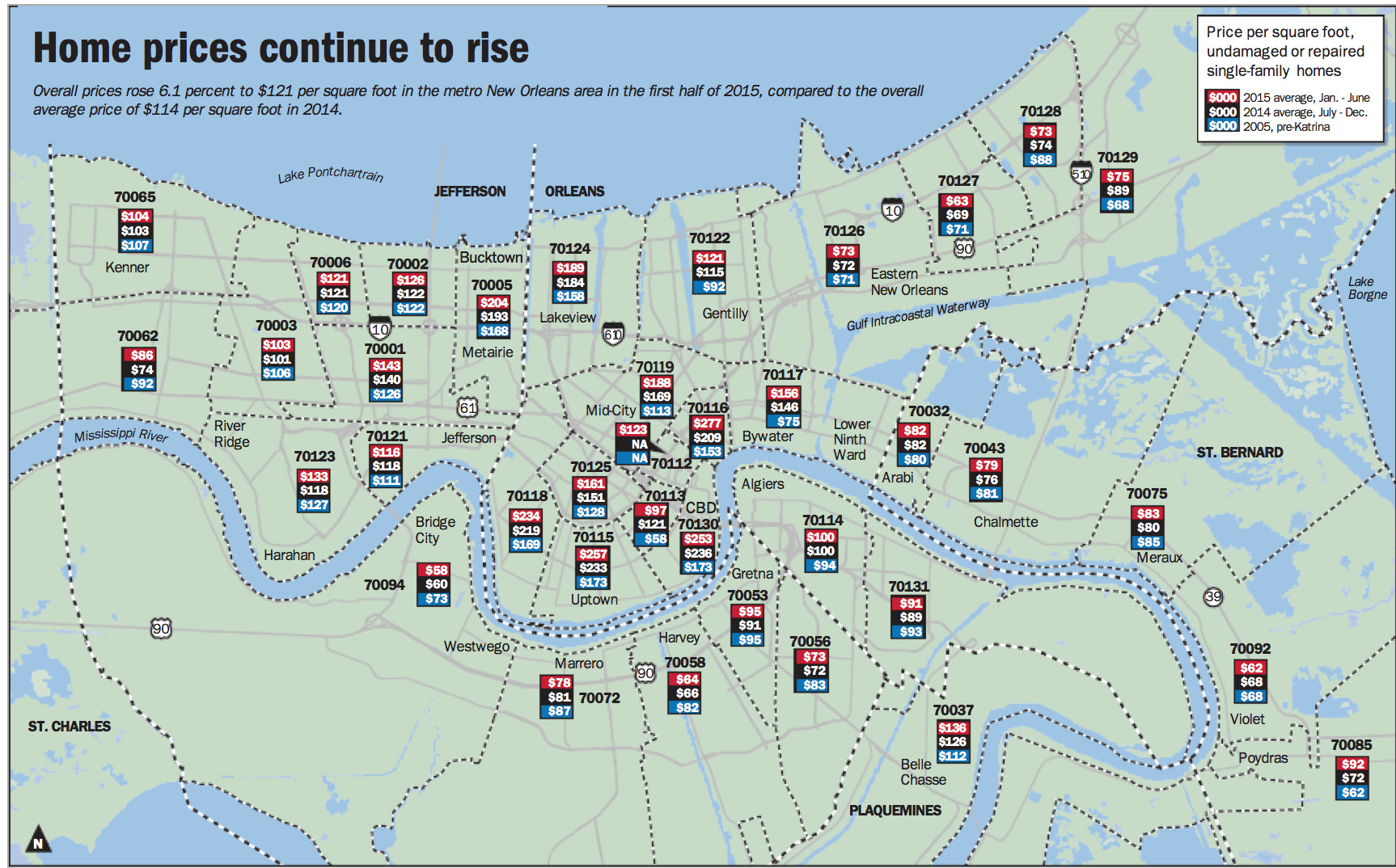
The idea is clear enough, the price per square foot values are displayed hovering over each respective zip code. The article was titled “Why New Orleans-area home prices are skyrocketing; check out where increases are biggest” so naturally I first attempted to do that. I looked at my old neighborhood (70130) and saw that it went from $173 to $253. Okay, so subtract and that’s an increase of $80. But what about the other ones? How would I see where the increases are biggest like the article suggests? Or what if I want to know the biggest decrease instead? I suppose I could subtract them all and compare them, but that would be a misleading comparison because I think what I really want to see is the percent changed, not just the difference. It’s like comparing apples to oranges otherwise.
This map looks very nice but I think it fails to show the trends. I decided that taking a shot at building my own interactive map would be a fun weekend project. It didn’t turn out the way I wanted, and I would have liked to spend more time making it look good, but it was still fun and I thought other people might enjoy it. The following article will explain the techniques and decisions involved in building it but if you find all that boring you can just view the map here.
Collecting And Processing the Data
As is typical in web news stories, the link to the source data appeared to be dead or incorrect. I realized all the trouble of finding the data or trying to parse it out of the pdf or whatever it is wouldn’t be worth it since hand transcribing into a CSV would only take about 30 minutes.
In the spirit of sharing here is the csv with the processed data.
After doing that I needed to process and explore the data so I can do some pre-computation as well as help make decisions about the visualization. When exploring data I always start by creating a notebook in ipython notebook (now jupyter).
First, some code to pull the CSV and calculate the percentage changes between the years using pandas. I only worked with the pre-katrina to 2015 range for this project because that is what I found interesting.
import pandas as pd

df = pd.read_csv('data/nola_house_data.csv', index_col=['zip'], na_values=['n/a'])

# dropping unless all 3 columns filled (incomplete data)
# this drops a couple zips (70112 for instance)
df = df.dropna(thresh=3)

def pct_change(c1, c2):
    return (df[c2] - df[c1]) * 100. / df[c1]

df['pct_change_2005_2015'] = pct_change('2005', '2015')
I was then able to sort on that column and I found that the biggest decrease was 70058 at -21.9% and the biggest increase was 70117 at 108.0%. I also wanted to know how the data was distributed over this range so I created a distplot
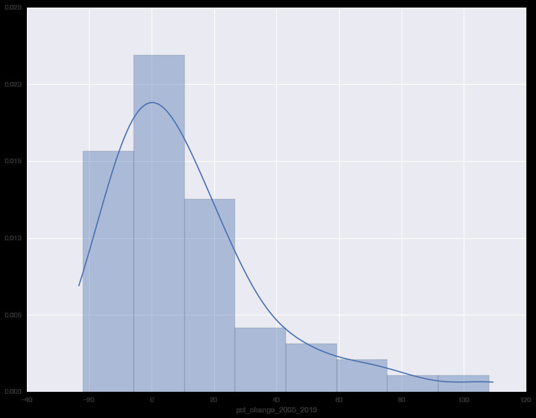
As you can see, most of the data is distributed around the -20% to 25% range. (The mean being 11.3% and the median being 3.9%) I also used this opportunity to apply a function to calculate the Freedman Diaconis size which was 10. Both of these details will be important for later on.
Preparing the Data for a map
The original visualization used color purely for classification of the year. The color choices were arbitrary and did not actually encode any information. What I wanted was a choropleth map. Each zip code will be colored to encode it’s percentage change in price. In order to do this we need to choose a color progression. When you have data that is meant to show some tendency away from a center, what you are looking for is a bi-polar or (diverging) color progression. That way, the center of the information spectrum (no change in price) and the side that the data sits on can easily be understood at a glance. There are ways to generate these but I found this neat tool to help with this process and I prefer to use their design advice. So I opened this up and choose diverging for the colors. Then i chose 10 for the number of classes (from our Freedman Diaconis rule). I also selected colorblind safe. Then I just copied all of them into a javascript object so I could experiment later.
If I was going to overlay and color the zips on a map, I’d need the data to describe the shapes and locations of the zip codes. I was able to get them in geojson format from this project.
wget https://github.com/jgoodall/us-maps/blob/master/geojson/zcta5.jsonThe only problem is this is all the zip codes in the US. Also, the properties have some junk in them. Since my map is going to consume geojson anyway, I just wanted to parse out the zips i care about and insert the data into the properties portion of the feature (while clearing out the other junk). I did this using our dataframe of zip data (df) from earlier.
import geojson

with open('data/zcta5.json', 'rb') as allzips:
    feature_collection = geojson.load(allzips)

def orleans_only(feat):
  return int(feat.properties['ZCTA5CE10']) in df.index

def transform(feat):
  """remove extra props and put on the props from the dataframe"""
  z = int(feat.properties['ZCTA5CE10'])
  data = df.ix[z]

  feat.properties = {
    'zip': z,
    'pct_change_2005_2015': data['pct_change_2005_2015'],
    '2005': data['2005'],
    '2015': data['2015']
  }

  return feat

orleans_features = filter(orleans_only, feature_collection.features)
orleans_features = map(transform, orleans_features)
orleans_collection = geojson.FeatureCollection(orleans_features)

f = open('data/orleans_zips.geojson', 'w')
f.write(geojson.dumps(orleans_collection))
f.close()
By the way, I posted this raw geojson data as a gist.
Creating the map
I had plans to finally learn d3 for this project but skipped that idea once again. In fact, the resulting map code is really quite horrible. Don’t look at it. I just wanted to be done with it in one night (kind of like a hackathon). It would be nice in the future to investigate using React with leaflet for use in a bigger project.
So what I did was basically just take some leaflet code I made for a previous experiment and just typed and refreshed my browser until it worked. I made some hacky little controls so I could experiment with colors and binning methods and I decided to just leave them in. I also wanted to have a hover window with the details but once I realized that would take more than 30 minutes I gave up so the details just sit in the top right.
The mapping code is the least interesting. The heart of it is a leaflet function that takes a geojson feature and applies a style:
function style(feature) {
  return {
    weight: 2,
    opacity: 1,
    color: 'white',
    dashArray: '3',
    fillOpacity: 0.65,
    fillColor: getColor(feature.properties.pct_change_2005_2015)
  };
}
The two most difficult things were deciding on the binning range and the base map. Unlike say, the shape of a US state, the shape of a ZIP code isn’t very recognizable at a glance so a base map was needed so you can orient yourself. All of the greyscale and black and white maps were too bright so I just chose a dark one. It looks kind of weird but it’s the best I could do.
Choosing the bin values was strange because of the skewed distribution of the data. I created two methods, zero and fit. Zero is as you would expect with a bi-polar progression where 0% is pure white and anything above or below it takes on the respective hue. Fit evenly fits the bins given the min and the max values but because it’s so skewed to the positive side it ends up a sea of blue. It does help you see the differences at the extreme level though. Perhaps a higher class number would have been appropriate? I didn’t take the time to find out. I’m sure talking to a GIS expert would yield a good way to deal with this problem but I will save that for another weekend.